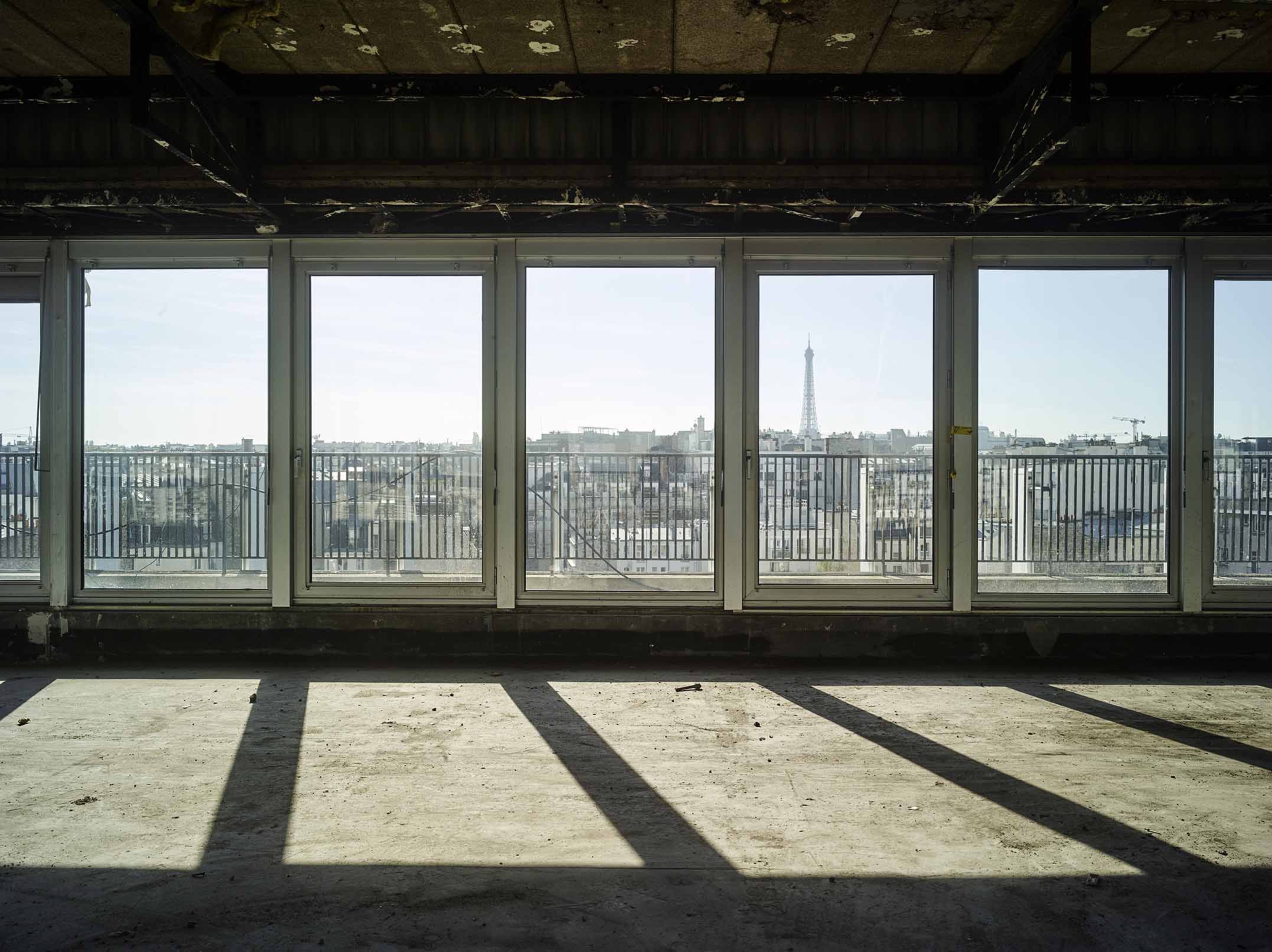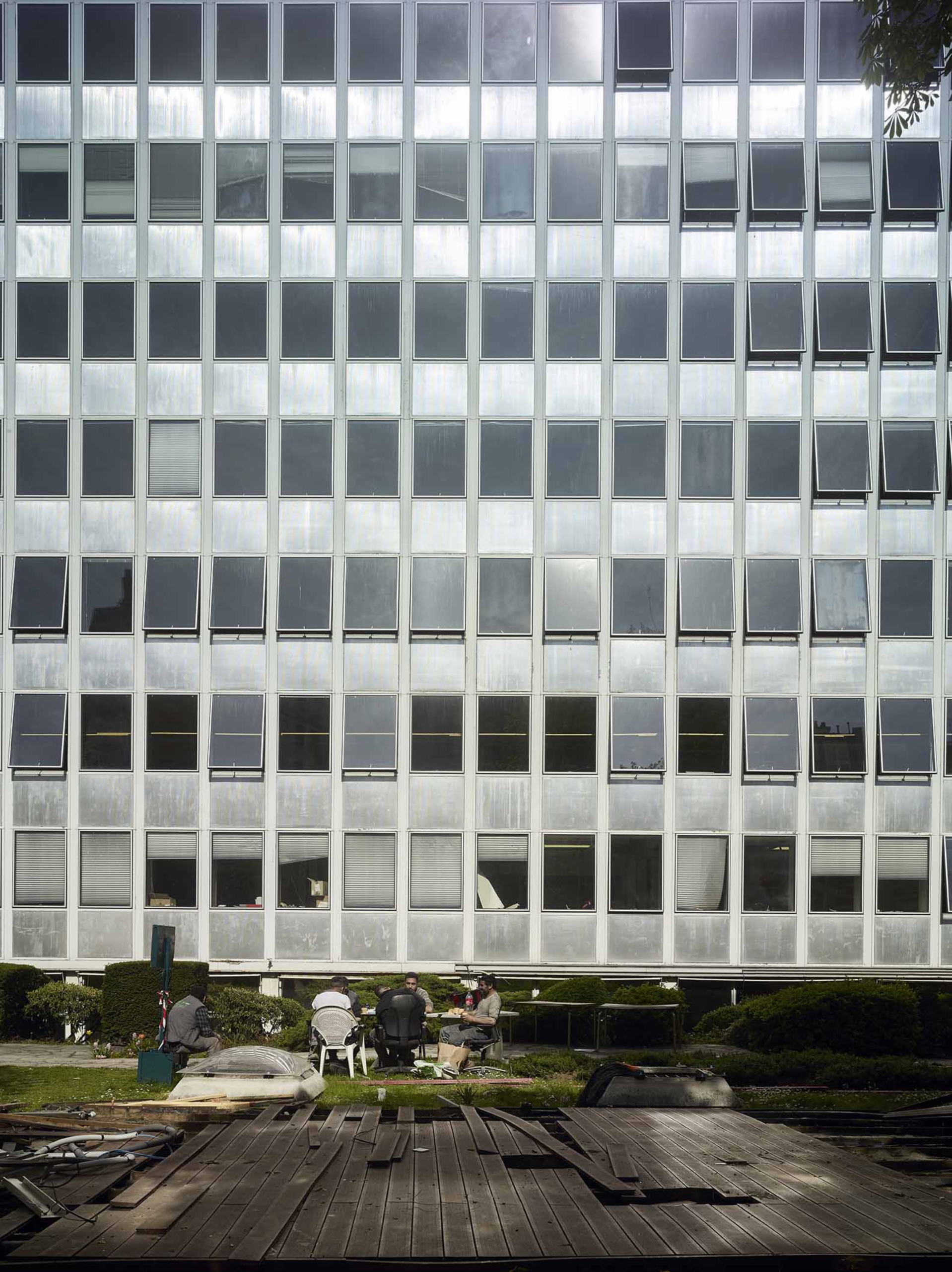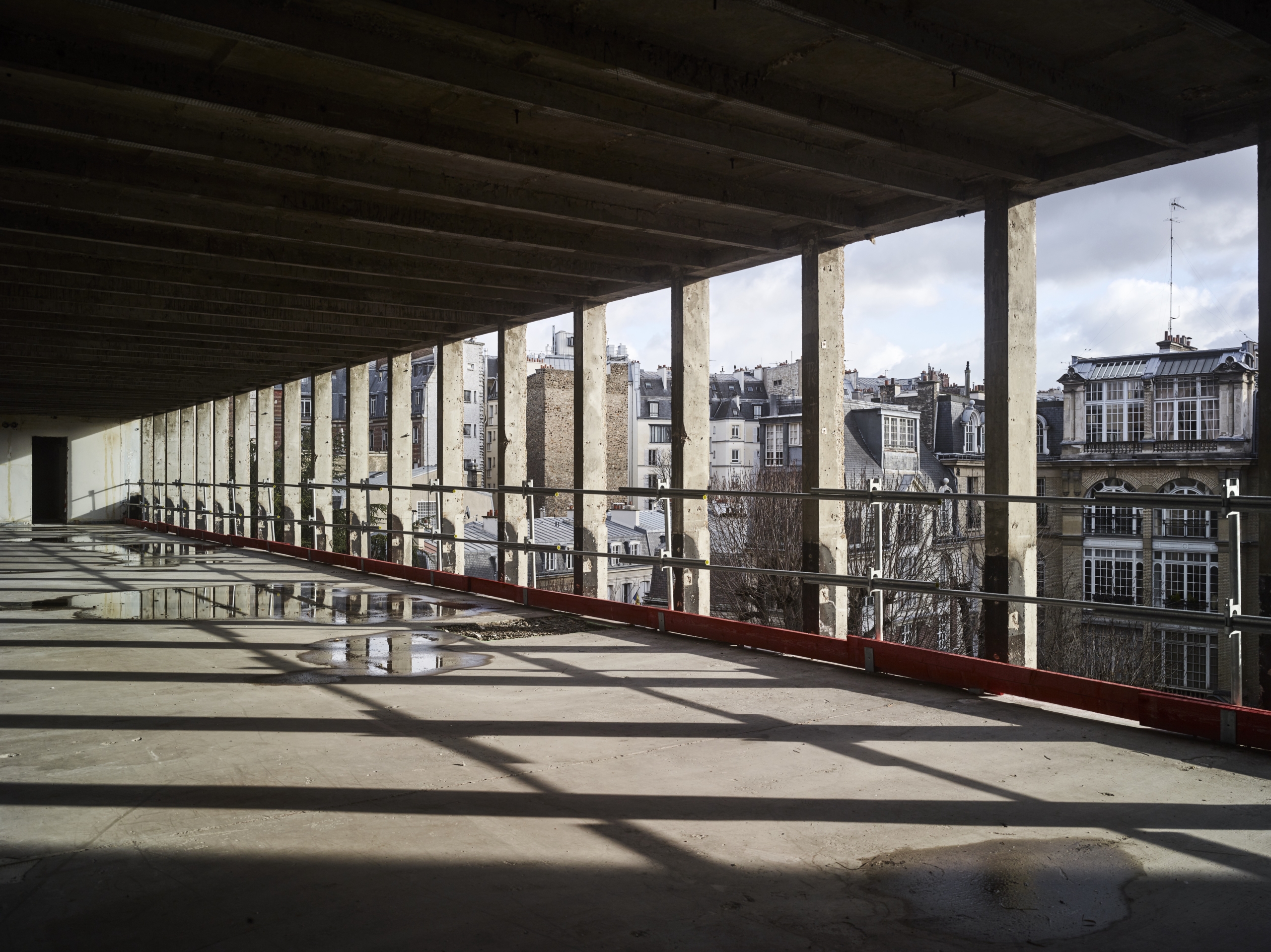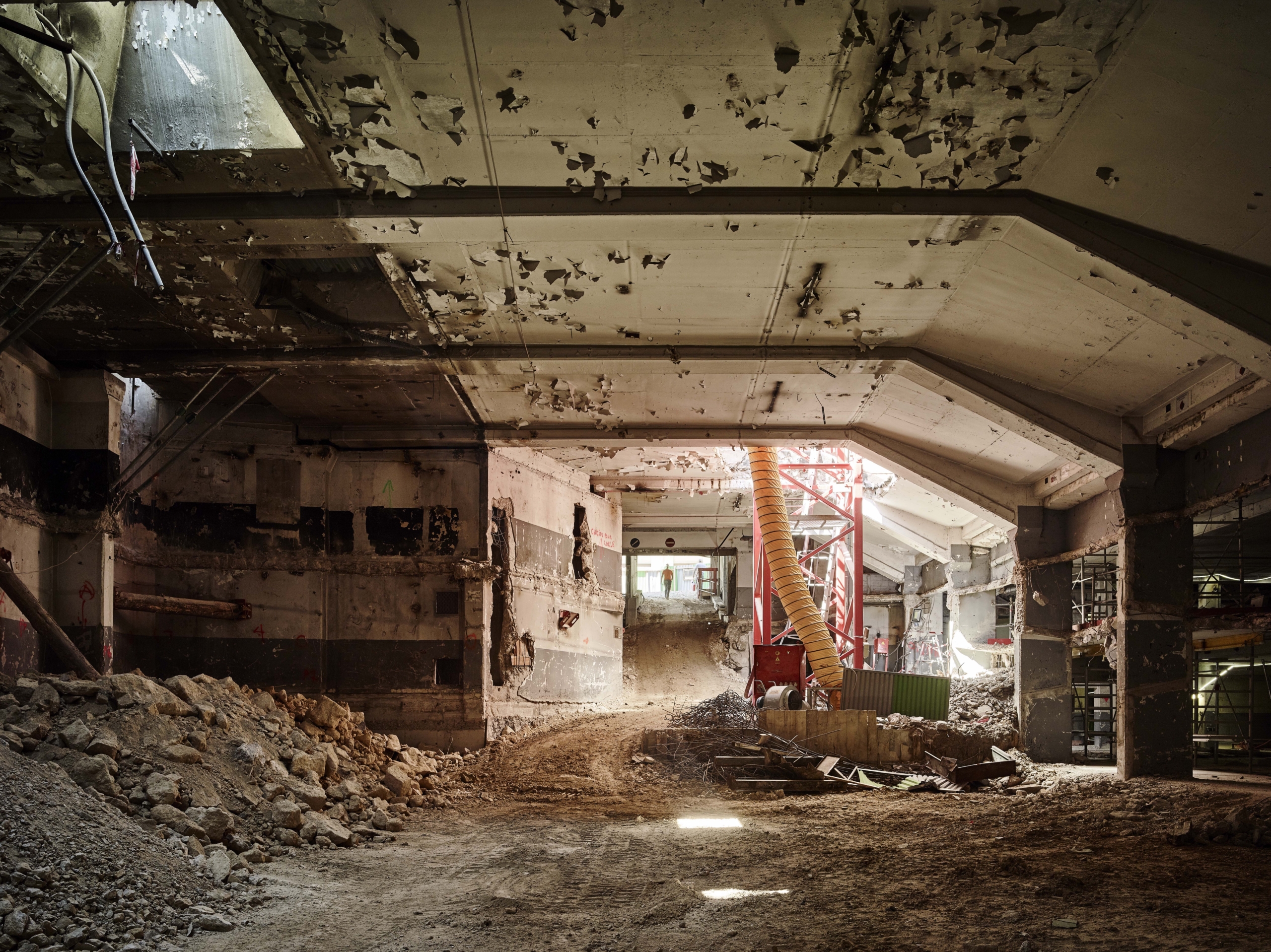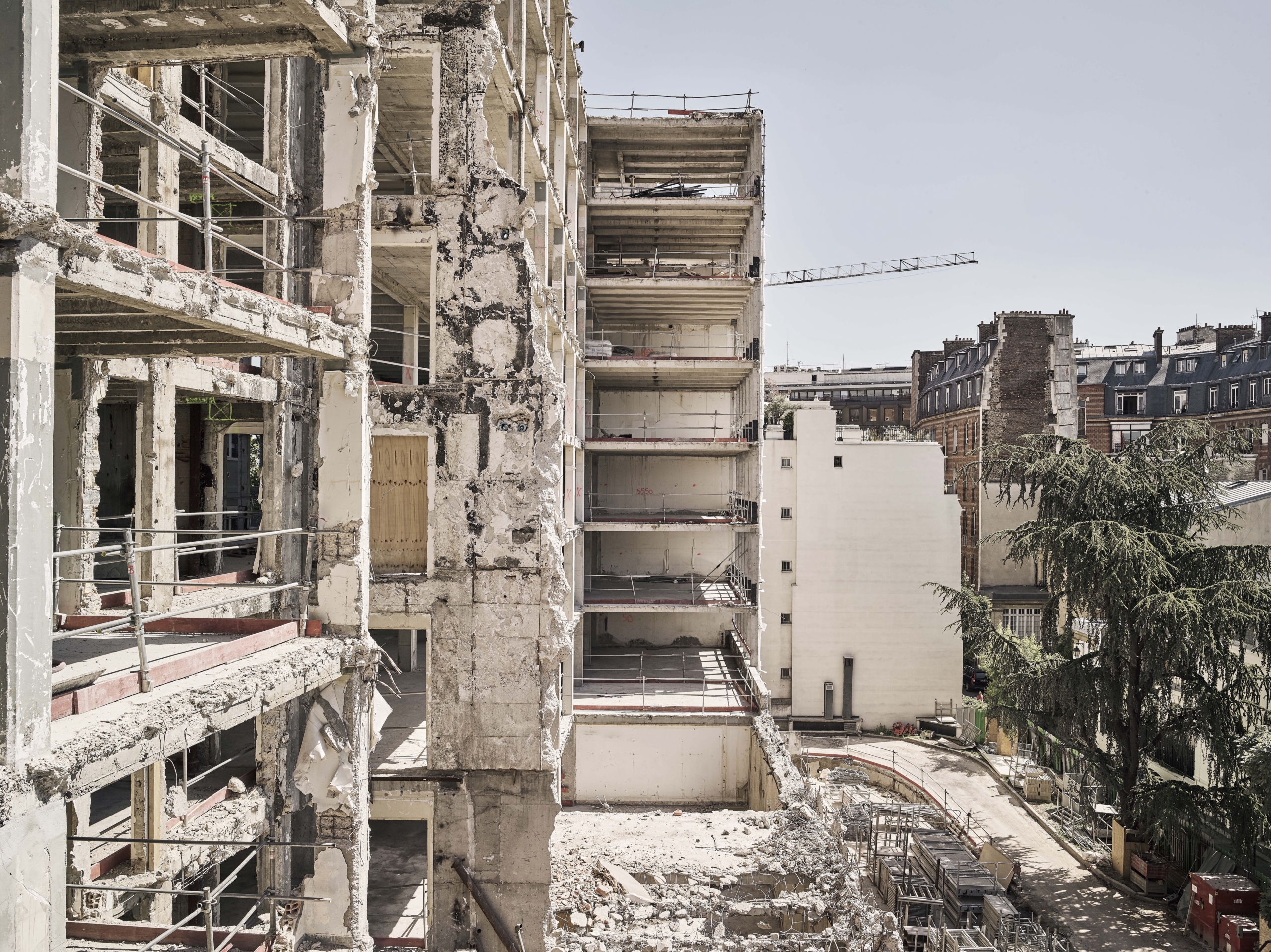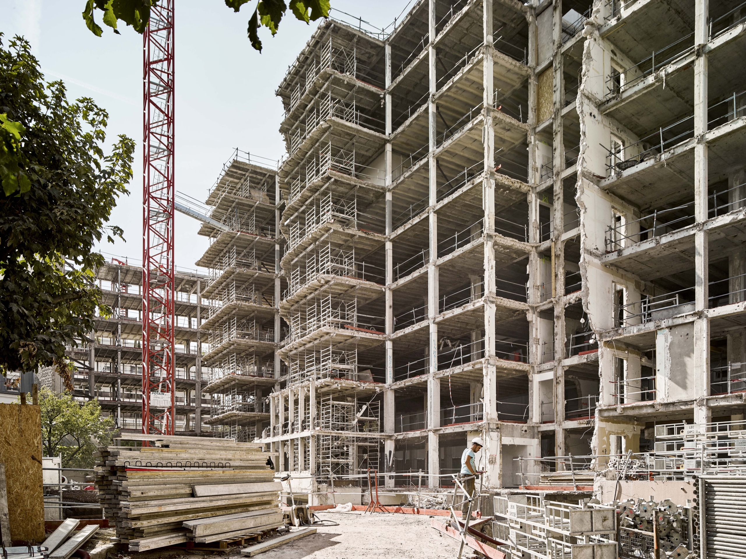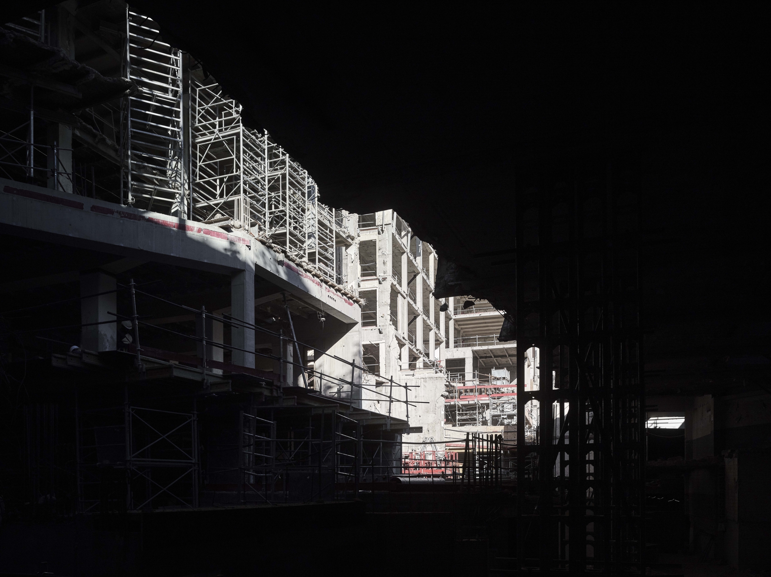
The symbol of a district undergoing urban revitalization
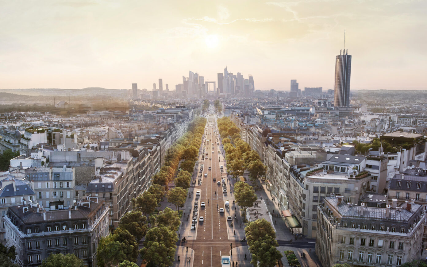
The Freedom complex holds a strategic position at the heart of one of the French capital’s main gateways from the west. Its restructuring, led by PCA-STREAM, touches on issues at the scale of both the city and Greater Paris. Similar to the original project, which was designed to fit together with Porte Maillot’s post war development plan, its reinvention works to resonate with the profound changes happening within the district. The area is actively undergoing an ambitious renewal project, designed to transform the traffic circle into a public plaza. It involves creating a median strip (fostering soft mobilities) with redesigned walkability, integrating the regional bicycle express network RER V, redeveloping the gardens adjacent to the plaza (in order to connect them to the Bois de Boulogne), and upgrading public transport (with the arrival of the RER E regional express train line and tram line T3). Through traffic calming and the transformation into a metropolitan hub, Porte Maillot puts on a fresher, more vibrant, dynamic face, tying in with the broader makeover of the Axe majeur that stretches between the Tuileries and La Défense. Ongoing and upcoming projects there are working to stitch various segments of the urban fabric back together and adapt it (in a sustainable and desirable way) to the challenges of the twenty-first century, including erasing the road interchange dimension of the Porte Maillot… Though its contemporary reinvention that makes it the first completed project of Porte Maillot’s urban renewal, Freedom serves as a beacon for the area.
A modern heritage that needed to be reinvented
An Emblem of Rationalist Architecture
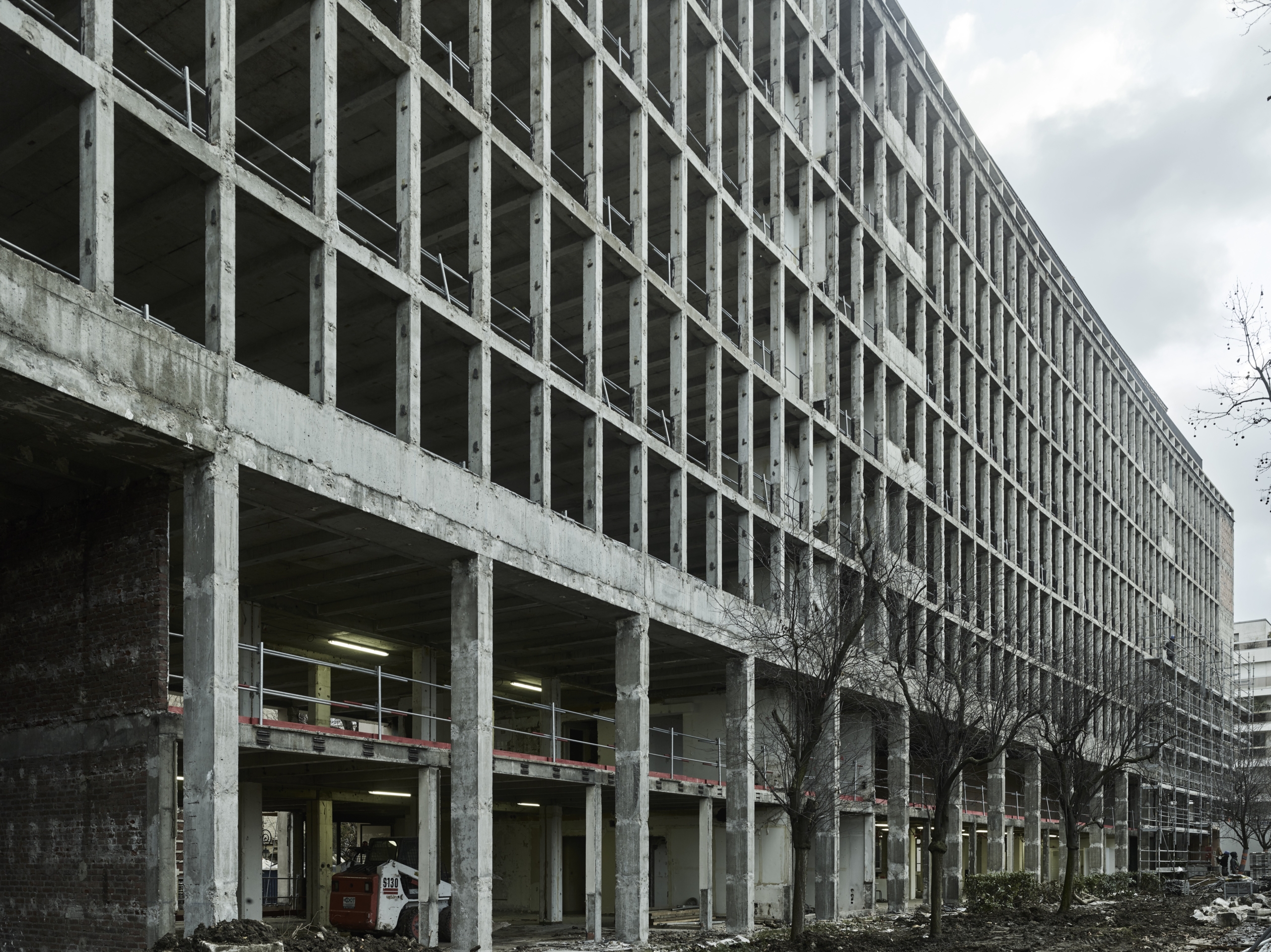
Built in the mid-1960s for Kuhlmann Group, a French chemical industry flagship, the Freedom Building is a prime example of institutional modernism, born out of the postwar years. Exceptional in terms of its linear length, the building is arranged following a rigorous and sober (but also monumental) geometric pattern typical of premier office buildings from the postwar boom of the Trente Glorieuses.
Freedom was designed by René-André Coulon, a former collaborator of Robert Mallet-Stevens. He was the lead architect of many large-scale public programs, as well as the Méridien Étoile Hotel in the immediate vicinity. It was largely promoted in the architectural press of the 1960s and is still considered a premier twentieth-century building in Éric Lapierre’s Guide d’architecture Paris 1900–2008, a reference work published by Pavillon de l’Arsenal.
Featuring fairly technical elements for the time—in particular, the window frames and the metal curtain wall façade—the building embodied a certain notion of modernity and luxury, with its marble-clad hall, bright suspended ceilings, and elegant wooden paneling, which suited the prestigious context of this posh tip of the Central Business District.
An Outworn Complex
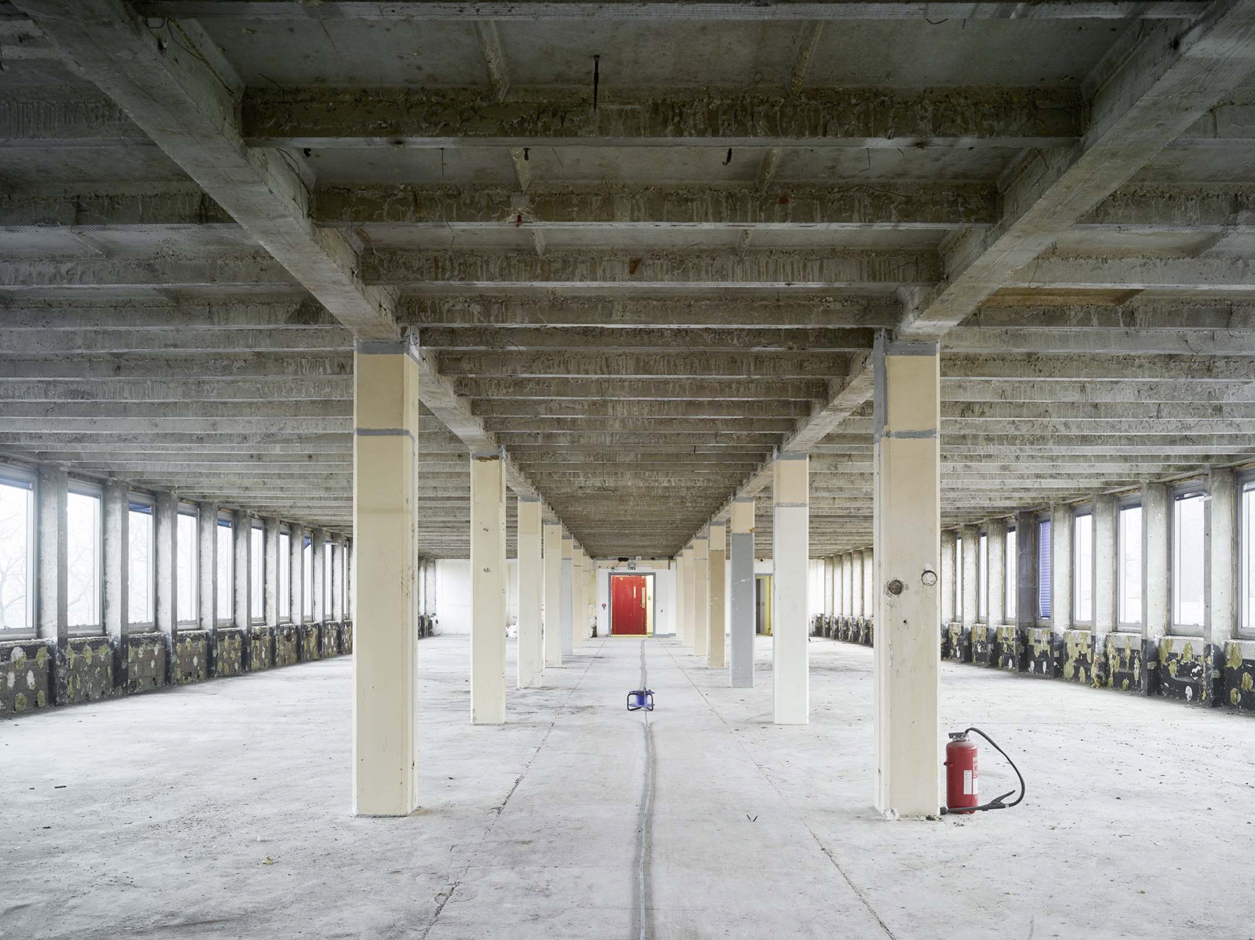
Almost half a century later, Freedom nevertheless presented a lackluster appearance. The building was relatively inconspicuous in spite of its great length, presenting a mismatch between its lost class and that of the district. Organized functionally, yet devoid of any particular quality, it suffered from the succession of uninspired refits that failed to fully address the issues linked to the low ceiling height and the relative narrowness of the floors of the building, especially compared with contemporary standards for office spaces.
The exterior of the building presented a largely degraded frontage, with missing pieces in its marble cladding and obsolete and nonfunctional windows and frames with low energy efficiency, on the south façade in particular. Reworked several times already, its interior decoration had lost its original integrity, resulting in a dull ground floor that lacked any transparency of views towards the garden, which, over time, had become cluttered with delivery areas, as well as service rooms and boxes, depriving it of any visual or use quality. From a technical and regulatory perspective, the complex had also fallen well below standards, in particular in terms of safety and accessibility.
Architectural strategy
PCA-STREAM developed an architectural strategy to ensure the financial viability of a necessarily heavy restructuring through the addition of additional space within the superstructure and the broadening of the south side, all the while satisfying the four principles for the tertiary spaces of the future, which were identified by the studio over more than a decade of applied research carried out by its research arm.
Acting as a Beacon, by Combining Heritage and Modernity in the Façade
More than ever, the purpose of a headquarters is to embody the identity and the distinctive values of the company for clients and staff. To achieve this, PCA-STREAM opted for a modernized reinterpretation of the façades, further emphasizing the original principle of a Janus building with two faces of different natures.
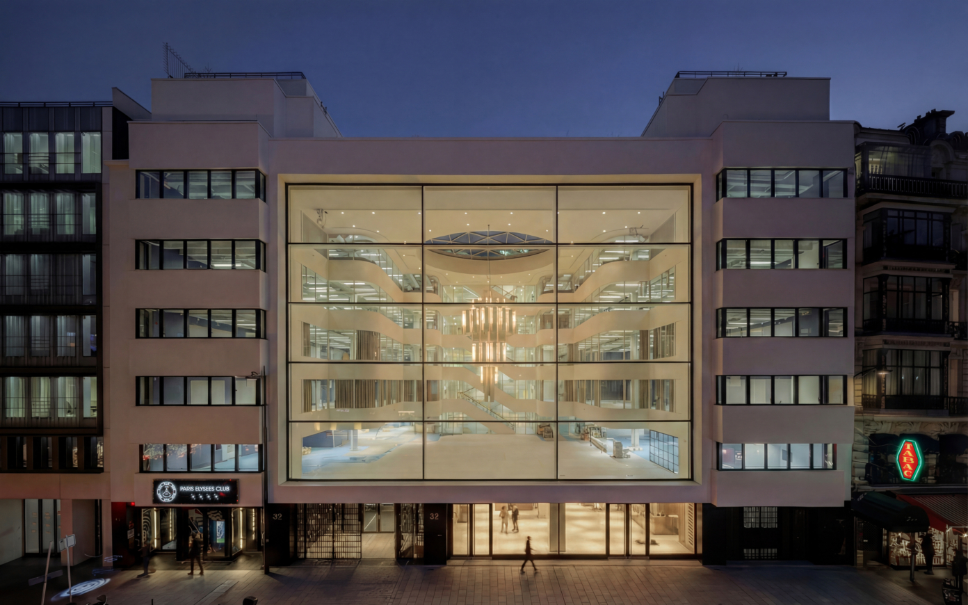
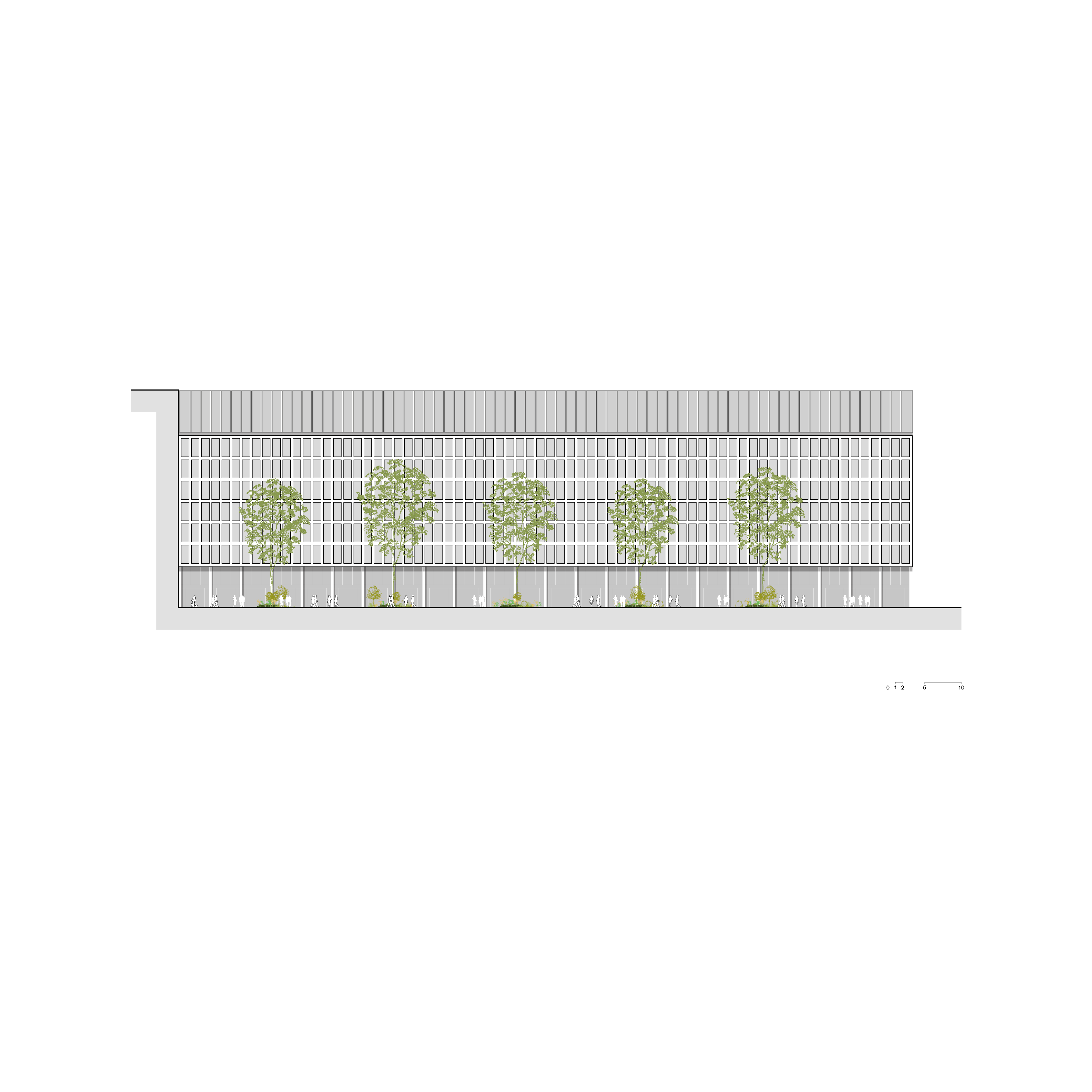
On the north side, towards Porte Maillot, the rigorous original writing of the building is preserved, all the while being updated technically and stylistically. New external insulation optimizes the energy performance of the building, while removing the sills, allowing for full-height glazing that brings in brightness, makes up for the low ceiling height, and further streamlines the building’s geometric pattern. The use of marble serves as a patrimonial reminder of the original monumentality of the building, highlighted by an outstanding double-height entrance.
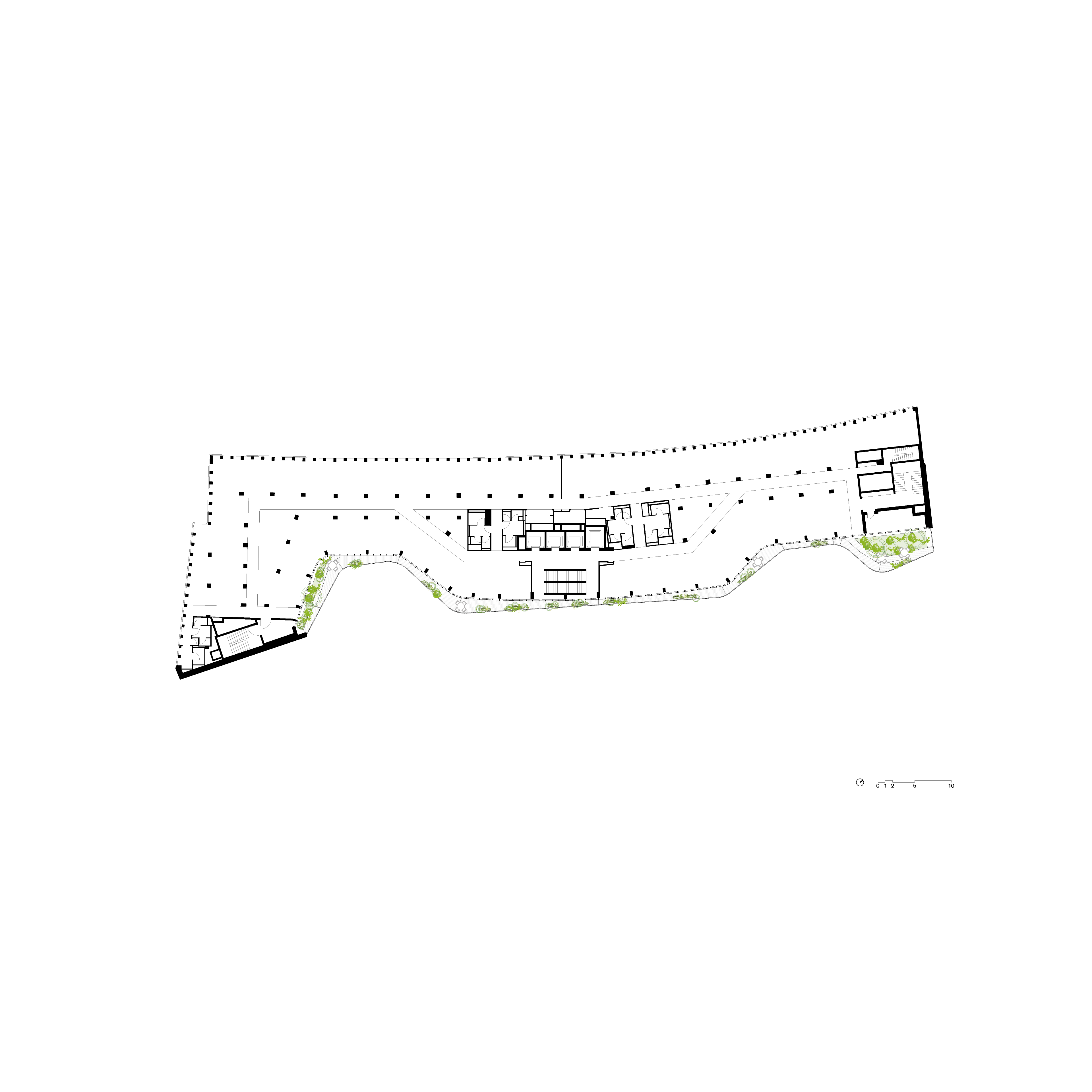
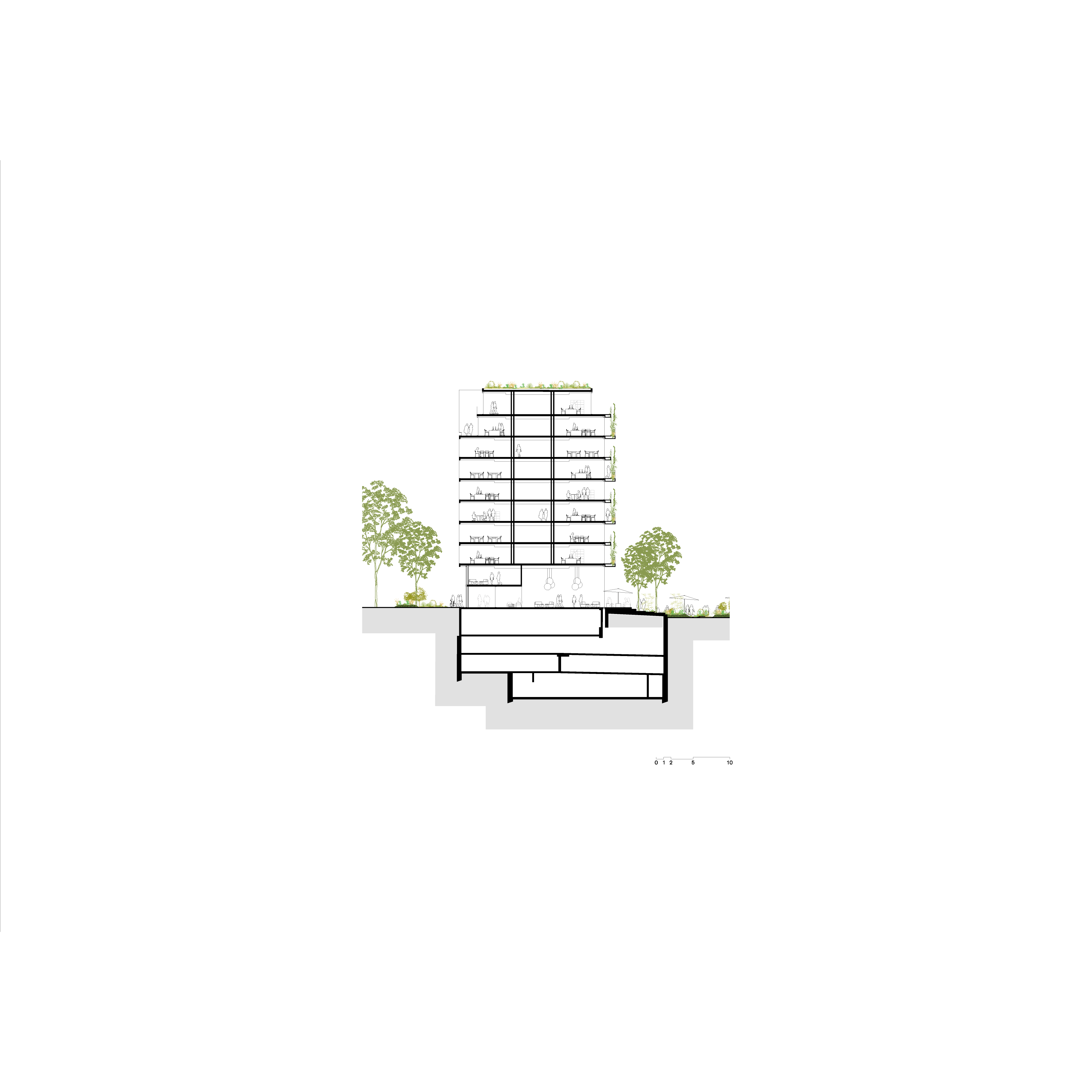
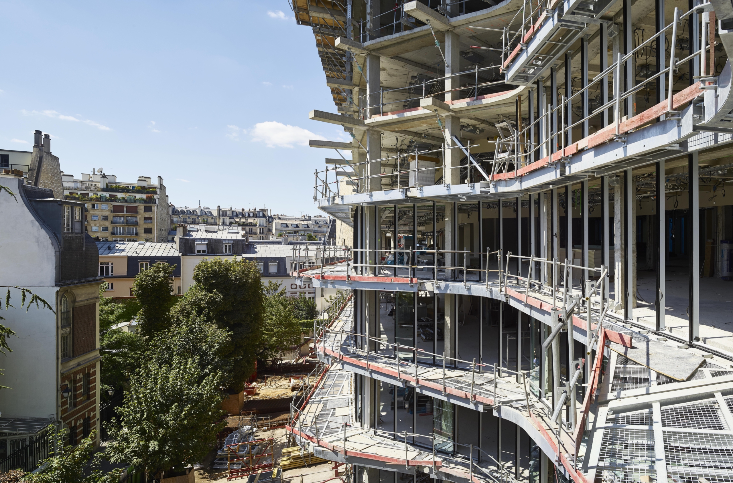
On the south side, the studio created a completely new living façade featuring attractive outside areas in the form of terraces and balconies. Featuring more organic curving forms and adorned with vegetation climbing up its full height, which limits the perceived mass, this façade is better related to the domesticity of this part of the neighborhood, overlooking the gardens of private mansions.
Finally, in order to act as a beacon from the western gateway to the city, the building is crowned with a monumental double-height gallery atop the cornice that runs along the full length of Avenue de l’Amiral-Bruix. Made up of photovoltaic glass louvers, it lights up at night like an urban lighthouse, its LEDs providing a subtle gradient of color in a programmed sequence that draws inspiration from the cycle of the seasons.
Creating Abundant Common Areas and Enhancing the Circulations
Offices are a full-blown management tool. Architecture must spatialize the collective experience, which governs innovation, efficiency, and serendipity in cutting-edge companies. As highlighted again in the early post-pandemic, being able to attract and retain the best talent in offices that foster well-being in the workplace is crucial.
In the case of the Freedom Building, the aim was to streamline the use of space, and restore legibility, especially by working on the circulations. A new vertical circulation is provided by a circulation core with elevators and a Chambord-style double-helix staircase which receives direct daylight and where users will have the pleasure of coming across one another. A high proportion of common, informal spaces foster social interaction and serendipity between collaborators, while numerous meeting rooms are strategically placed at the bottom of the staircases to serve as an invitation to work together. On the upper floors, large, modular, open-plan offices receive direct sunlight and offer pleasant, flexible working conditions, and all users now have access to the large alleyways and planted terraces as well.
Freedom has thus been adopted as headquarters by a leading “French Tech” company, Murex, which operates on a beehive model of project-based teamwork and large hackathons.
Offering a Broad Range of Services
Freedom’s office space will now be able to host a broad range of services, in particular by reactivating, in this instance, the base of the building, which is restored in its transparency.
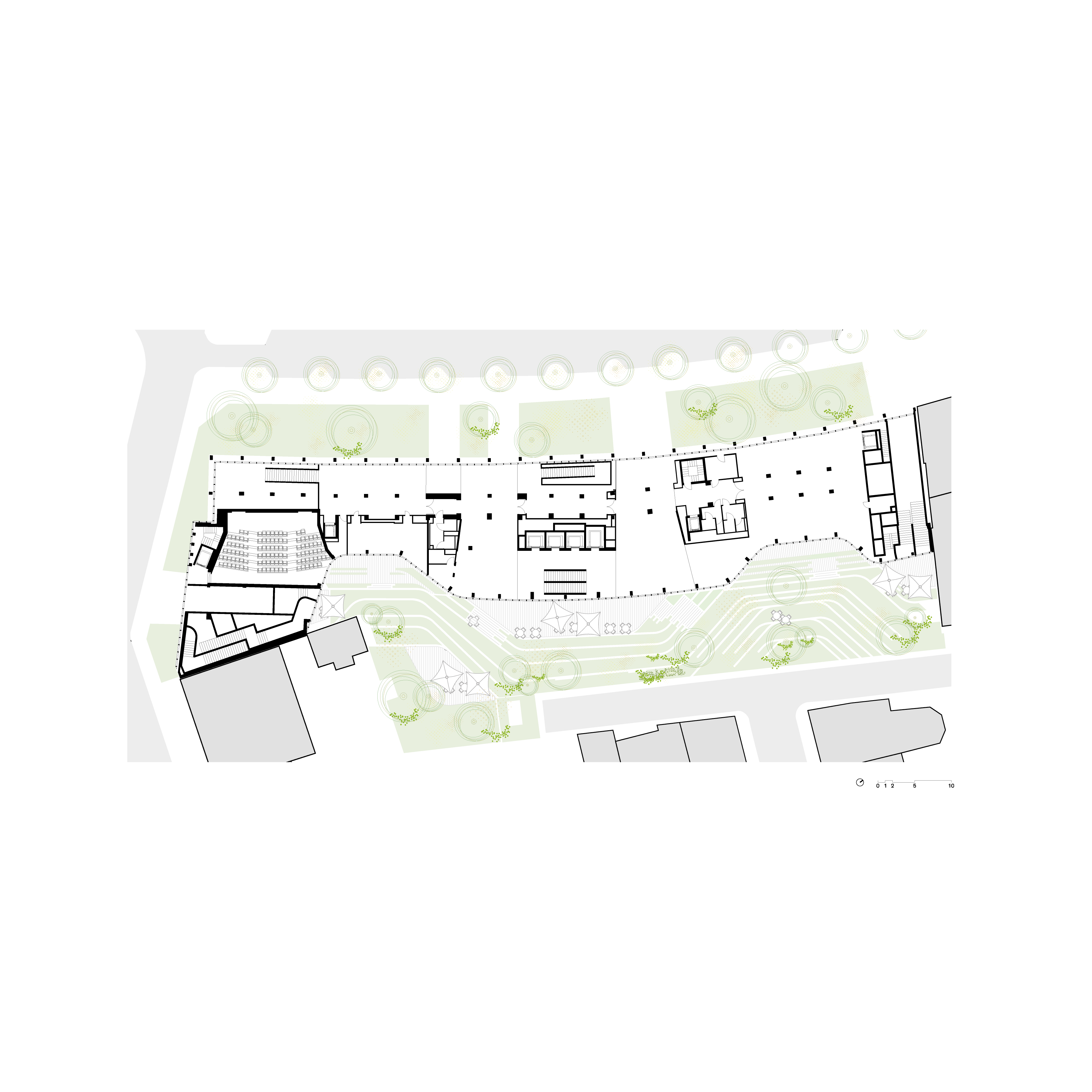
Relieved of its functions of servicing vehicle access, the upper ground floor becomes a space for leisure and recreation that is wide open to the city and offers a south-facing private garden. It invites informal work and social interaction in its lounge, and features an offer of services and catering, with a Click & Collect space for collaborators.
The lower ground floor includes a business center, including meeting rooms, a foyer, a cloakroom, and a tea room, as well as a 150-seat auditorium and a corporate restaurant, which can also be used for hackathons. Several tea rooms are also strategically distributed on each of the open-floor plates.
Offering Outdoor Areas for Reconnecting with Nature
Moving beyond the traditional image of the office as a cubicle farm, Freedom opens up to the outside world and works on its porosities with the surrounding city and nature. It is now scientifically proven that access to planted outdoor areas is a key driver of well-being and meets the aspirations to biophilia that are increasingly prevalent among the younger generations of collaborators.
For Freedom, PCA-STREAM has developed a rich dialogue between inside and outside that offers a new relationship to the landscape. On each floor, unobstructed visual connections are favored, including impressive glazed areas opening onto gardens, and terraces and alleyways that are widely planted, for an al fresco break or call. The private garden, with ideal south-facing exposure, is completely freed from any technical feature or delivery area, which allows for the unfolding of a rich landscaping project along several strata and hosting places for relaxing or enjoying lunch that connect to the building’s base.
Freedom, thereby, becomes a new piece in the urban development efforts that aim to restore the connections between Paris and the Bois de Boulogne. To this end, the gallery placed above the cornice, part interior and part exterior, offers breathtaking panoramas towards the public landscape garden.
A virtuous upgrade
Now is not a time for grand but gratuitous stylistic gestures. Any truly contemporary architecture must aim for sustainability, which is placed at the core of the Freedom project, starting from the initial decision to restructure the building rather than engaging in demolition and rebuilding.
Optimizing Energy Savings
The work undertaken to improve the building’s energy efficiency strengthened the architectural choice of a treatment differentiating two distinct faces in its envelope. To the north, the focus was on reinforcing outside insulation. The idea was to improve insulation while enhancing the lighting on the ground level and the different stories by substantially increasing the glazing in the window systems. On the south end, which is the area most exposed to sunlight, horizontal alleyways are designed to form fixed brise-soleil, while the climbing vegetation provides a cool screen during the summer that disappears during the winter, thereby optimizing solar shading on a seasonal basis and generating energy savings by requiring less air conditioning during the summer and less heating during the winter. The choice of a new Chambord-style double-helix staircase on the façade, both bright and pleasant, nudges users to use the stairs rather than elevators. Furthermore, the photovoltaic glass louvers of the gallery above the cornice help generate electricity that is reinjected in the building’s lighting program.
Bolstering Biodiversity
Eager to take advantage of the restructuring of the Freedom building to transform it into a true “building as landscape,” special emphasis was placed on bolstering biodiversity in the project. The remodeled landscaping of the garden has resulted in a marked increase in open ground and planted areas, which host additional large trees, as well as flowering meadows with a key ecosystemic role. Within the garden and in the planted area near Porte Maillot, bioswales provide effective water management. To the south, the remarkable living façade provides a continuum of vegetation, from the grass meadows to the planter boxes on the terraces, connected together by the naturally climbing plants, up to the inaccessible rooftops, which are fully planted. Freedom, thereby, firmly ties in the restoration of ecological corridors along the whole Axe majeur and offers an intimate connection to the nearby Bois de Boulogne.
-
Client
AXA Real Estate
-
Program
Restructuring of an office program
-
Location
15-25 boulevard de l'Amiral Bruix, 75016 Paris
-
Mission
Complete
-
Surface
17 500 m²
-
Status
Delivered in 2020
-
Certifications
— HQE Renovation Excellent
— BREEAM Refurbishment Very Good
— Effinergie Renovation Label
— WELL Silver
— IODIVERCITY Performance Level -
Team
— Project Owner: AXA Real Estate
— Delegated Project Owner: Vinci Immobilier
— General Engineering (BET Généraliste): Egis
— Façade Engineering (BET Façade): Elioth
— Acoustics: Acoustb
— Cost Consultant: EGIS
— Environmental Consulting (BET Environnement): Green Affair
— Fire Safety Advisor: CSD Faces
— Technical Control: BTP Consultant
— CSPS: LM3C
— Landscape Design: A&SE
— Exterior Lighting: 8'18''
— Kitchen Programming: Ceres
— Heritage Advisor: Grahal


